Graphic design
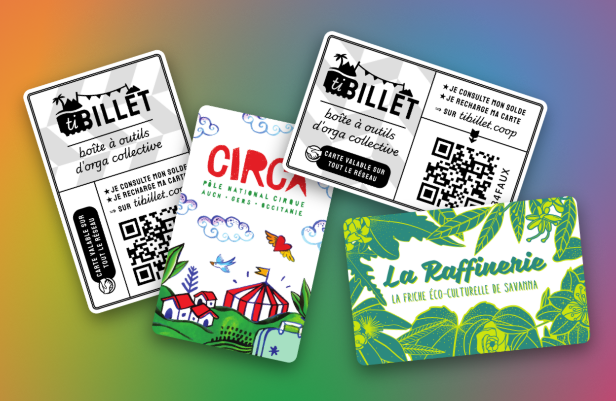
The graphical identity is still in development but we've got a few elements ready!
Inspirations
We were looking for something that would represent our ties to the cultural landscape, and distance us from the aesthetics of tech startups and other for-profit technological solutions to social issues. We aggregated two vibes we felt would mesh well together:
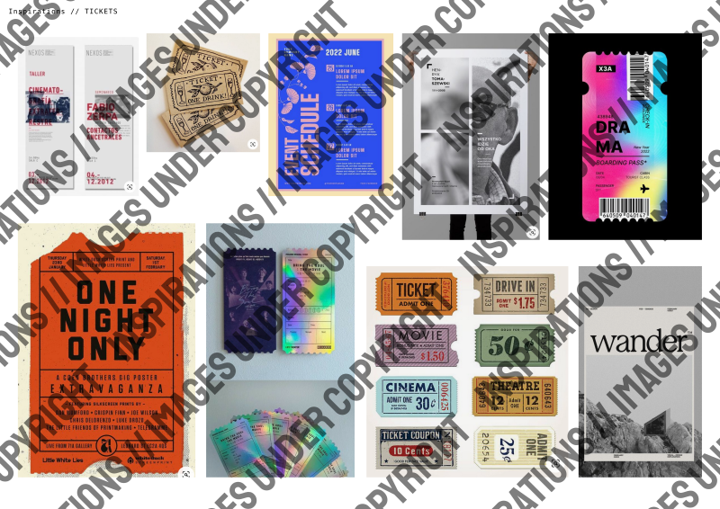
Tickets old and new: ticket design has always been a hallmark of cultural life, from the first date tickets you still keep in a treasure box to Willy Wonka's golden ticket. There are not one but two (🎟️!) (🎫!) ticket emoji: everyone knows at first glance what they are and has some fondness for the little paper things.
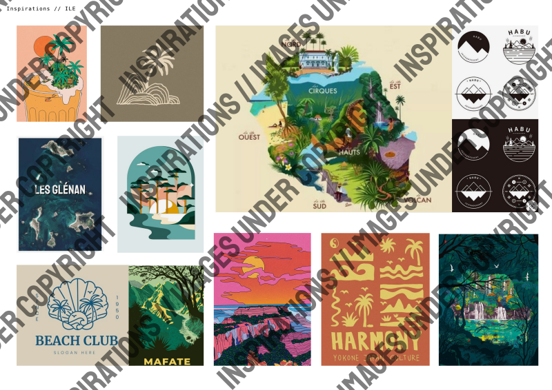
Another angle we came at was the island, the archipelago. TiBillet was born in La Reunion (find it on a map!) and has the ambition to connect communities together, little islands of communal life into bigger archipelagos, so to speak.
Iterations (fr)
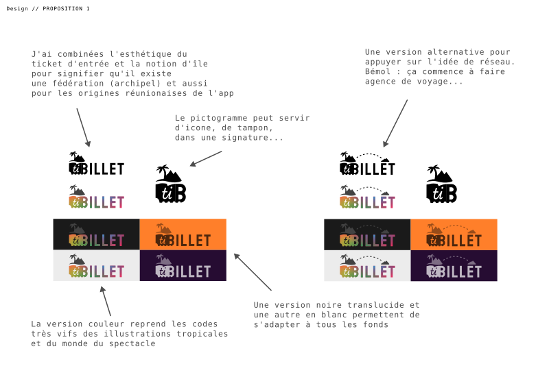
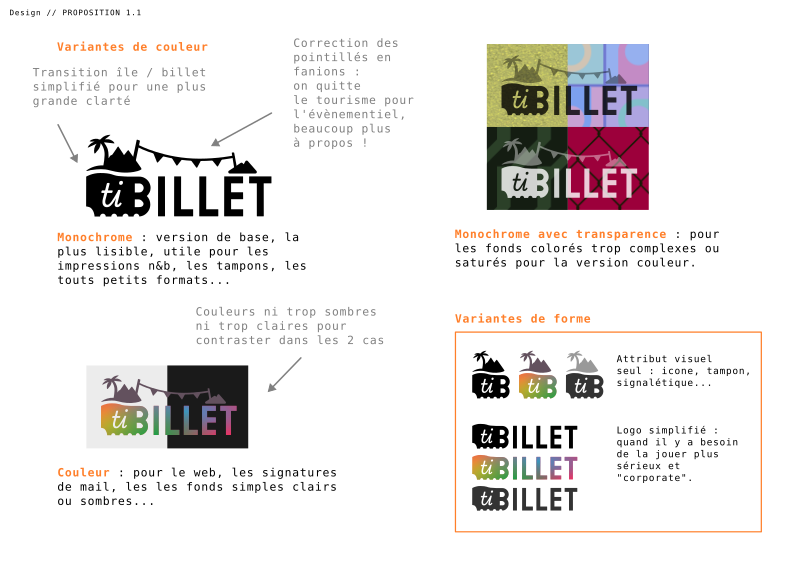
What we have settled on for now:
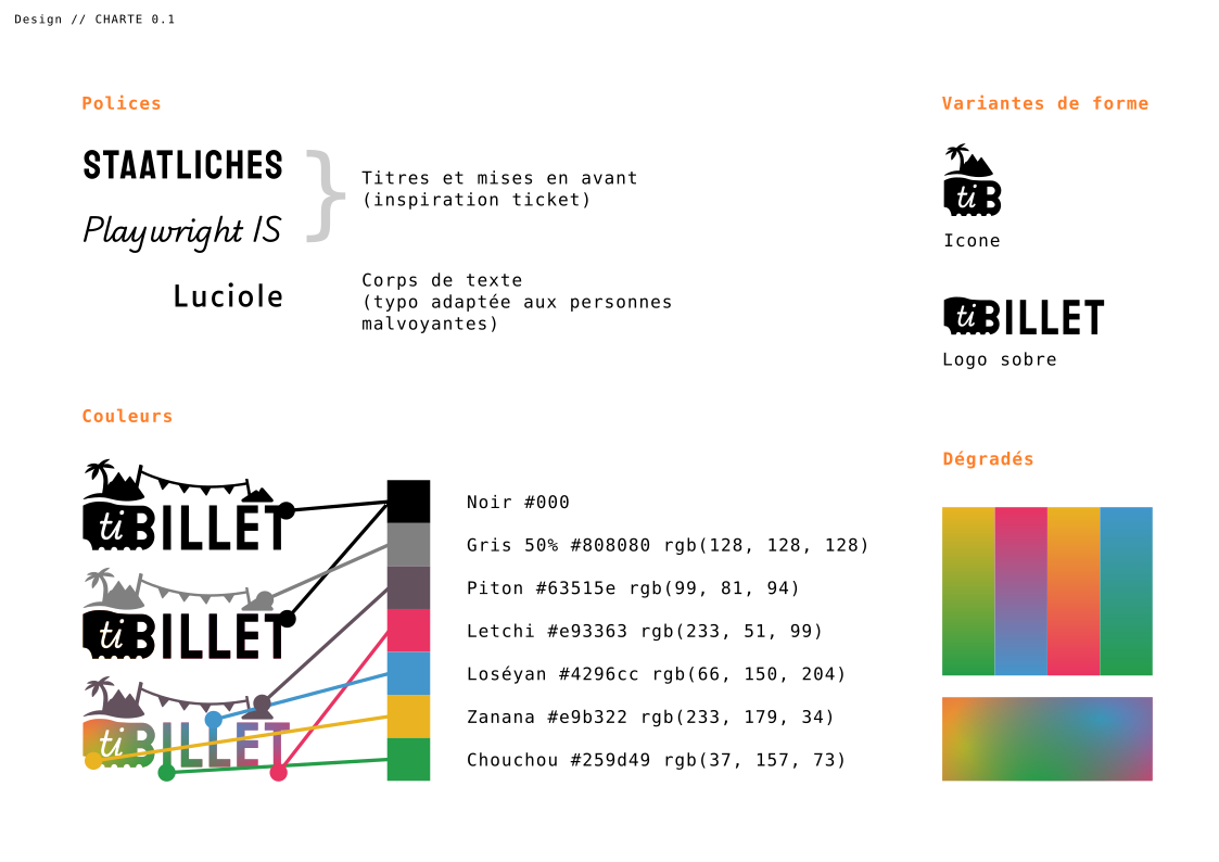
Resources
| Name | Use | Preview |
|---|---|---|
| Monochrome logo (SVG) | Usable for print and web, plain or busy backgrounds, color can be whatever you want (currently follows font color) | |
| Color logo (SVG) | Quality print or web, larger sizes, light or dark plain backgrounds to let it stand out |  |
| Monochrome icon (SVG) | For navbar icons, embossing, small signifiers, whatever color | |
| Color icon (SVG) | Favicon, app icon, small web branding | |
| Bracket pattern (SVG) | Backgrounds, can work under big fonts, whatever color | |
| Gradient pattern (SVG) | Backgrounds, fill of important elements, etc |  |